ShencoSmoke
is Blowin Smoke!
- Joined
- Jul 2, 2013
- Messages
- 1,927
- Reaction score
- 4,627
- Points
- 0
- Age
- 46
- Location
- The Shenandoah Valley
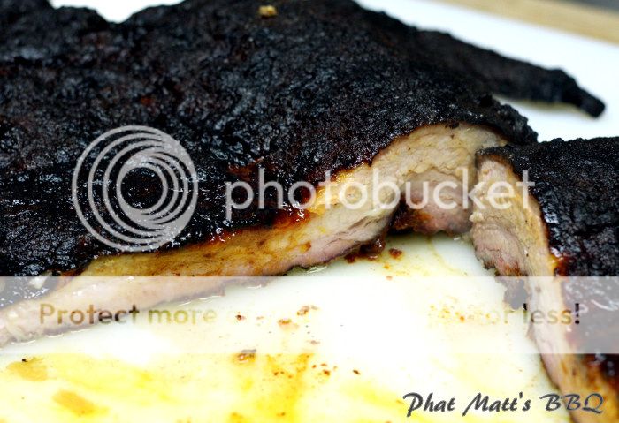
Hi all, first time post over here. Just getting my vending/catering business up and running and wanted get some Brethren feedback. I'm official (LLC, insurance, taxes, etc). This first image is my new facebook cover photo, also going to use it for other marketing material. What do you think?

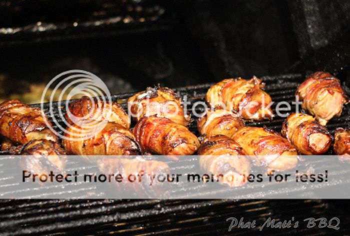
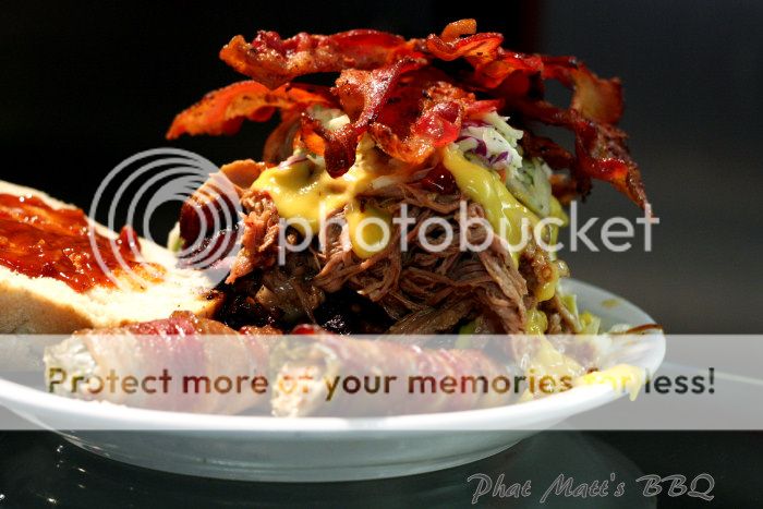
This second pic is an example of the stlye of photo I am going to use for facebook, webpage, etc. The question is: should I embed some type of logo in the corner of the image to avoid people stealing my photos from the web-based marketing material? Or would that take away from the images?

Thanks in advance!
This second pic is an example of the stlye of photo I am going to use for facebook, webpage, etc. The question is: should I embed some type of logo in the corner of the image to avoid people stealing my photos from the web-based marketing material? Or would that take away from the images?
Thanks in advance!